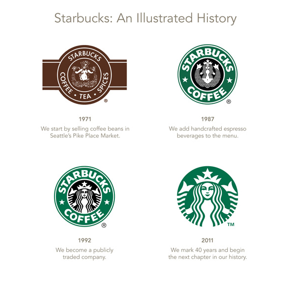
On January 15th, Will soon celebrate the 40th anniversary company Starbucks announced the replacement of their new visual identity. The company also proclaimed to start using the new logo in March.
The new logo is more streamlined, removing the original “Starbucks coffee” words green ring. The iconic mermaid logo is more prominent to show. The new brand identity reflects the company’s new strategic. Starbucks branded products will no longer be limited to retail sales channels, but will extend to other channels such as supermarkets. Besides that, Starbucks also try to create other products than coffee.
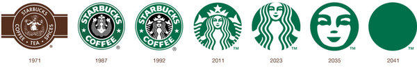
It should be noted that the new logo has just published, there are already a great number of the opposition comes online. Some netizens posted that they think the new brand lost its brand sense. They also argue that the new brand is just enlarging the old logo. Some even prodict their own thought of the further change about Starbucks’ logo.

Starbucks’ logo changed because of the change of sales strategy. It becomes more and more simple. Still, Starbucks new logo of the 40th anniversary retrigger a new “redesign” boom. What do you think?
